Yes, But What Does It Actually Mean? | No. 6
Correlation vs causation, the ice cream that never drowned anyone, and the difference between “moves together” and “makes it happen”
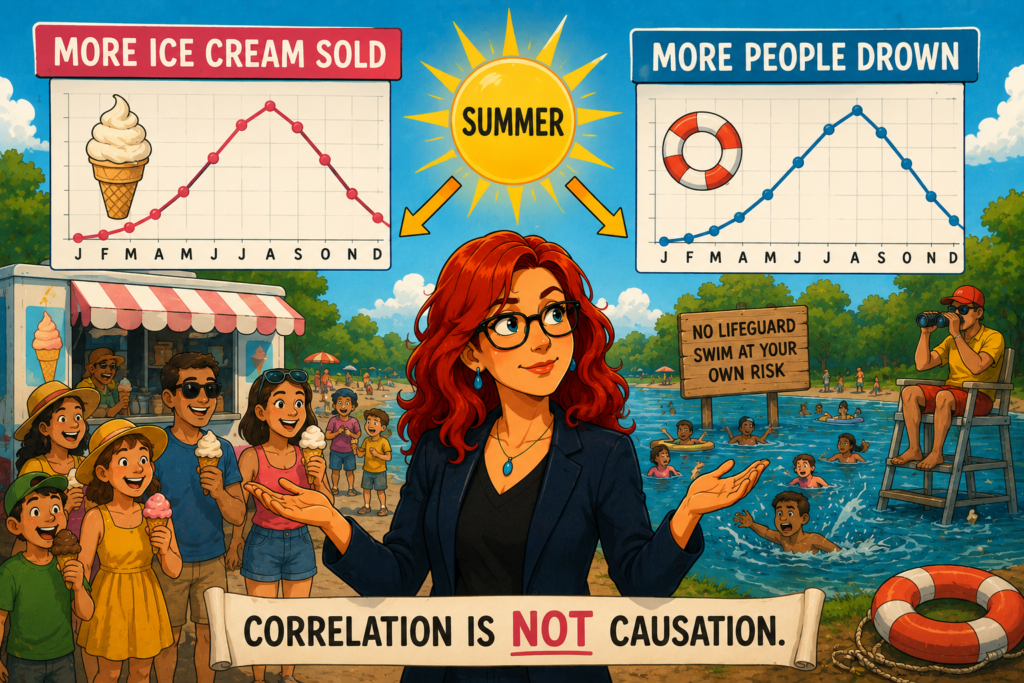
Here is a genuinely true fact. On days when more ice cream is sold, more people drown.
The two rise and fall together with impressive reliability. Chart ice cream sales against drownings across a year and you get a tidy relationship: as one climbs, so does the other. You could, if you were feeling brave and a little foolish, stand up and announce that ice cream causes drowning, and the data would appear to be right behind you.
It doesn’t, of course. The thing quietly driving both is summer. Hot weather sells ice cream and hot weather sends people into rivers, lakes and the sea, where some of them, tragically, drown. Ice cream and drowning have no relationship with each other at all. They just happen to share a cause, and that shared cause makes them dance in step.
This is the gap between correlation and causation, and it is probably the single most common way that a real pattern in the data leads to a completely wrong conclusion.
Two things moving together
Correlation simply means two things tend to move together. When one goes up, the other goes up (or reliably goes down). That’s it. It is a description of a pattern, and nothing more.
Causation is a much bigger claim. It says one thing actually brings about the other – change the first and the second will change as a result.
The trouble is that correlation is easy to measure and causation is hard to prove, so we are forever tempted to collect the easy thing and quietly upgrade it to the hard thing in our heads. A pattern appears, our minds supply a story to explain it, and the story almost always casts one variable as the cause of the other. It rarely stops to consider the far more common possibilities: that both are driven by something else entirely, that the causation runs the opposite way to the obvious reading, or that the whole thing is coincidence.
Why the mix-up is so tempting
Spotting patterns and inventing causes for them is one of the things human brains are best at. It kept our ancestors alive – rustle in the grass, therefore predator, therefore run – and it is not an instinct that switches off politely when we sit down in front of a spreadsheet.
So when two lines on a chart move together, “A causes B” arrives almost before we’ve thought about it. And it usually arrives in the direction that flatters our existing assumptions. If we already suspect that, say, a particular activity is good for students, and we find that activity correlated with good outcomes, we don’t tend to interrogate it. We tend to feel confirmed.
That is precisely when it pays to slow down, because at least three quite different worlds can produce the same correlation. A genuinely might cause B. Or B might cause A, with the arrow pointing the opposite way to the obvious story. Or some third factor, C, might be driving both, while A and B have nothing to do with each other at all. The ice cream and the drownings live in that third world. A surprising number of confident conclusions do too.
Closer to home
Here is one that catches people in our sector, because it comes dressed as insight.
You look at engagement data and find a clear, strong correlation: students who log into the virtual learning environment more often get better grades. The dashboard practically glows with it. The conclusion writes itself, and often gets written into a strategy – we need to get students logging in more. Emails go out, nudges are configured, dashboards start flagging low-login students for intervention.
But look again at the three worlds. Does logging in cause the good grades? Or are logins and grades both driven by a third thing – a student’s underlying engagement, motivation, or simply having their life in enough order to keep up? A motivated, well-supported student both logs in more and does better, and the login was never the cause of anything. It was a symptom.
If that’s what’s going on, then nagging a disengaged student to log in more is like noticing that healthy people own running shoes and concluding that if you post everyone a pair, they’ll get fit. You have targeted the symptom and left the cause untouched, and then you get to be puzzled when the intervention doesn’t move the grades. The correlation was real the whole time. It simply never meant what everyone assumed it meant.
What to ask instead
You don’t need a statistics degree to keep yourself honest here. You mostly need to resist the first story your brain offers, and a few questions help:
Could this run the other way? Before assuming A causes B, check whether B might just as easily cause A. The obvious direction isn’t always the real one.
Could something else be causing both? Hunt for the hidden third factor – the summer, the underlying motivation – that might be driving each of them independently.
If I acted on this as though it were causal, what would I actually be changing? Sometimes just imagining the intervention exposes that you’d be tinkering with a symptom.
And the blunt one: do I actually know this causes that, or have I just seen them move together? Most of the time, honestly, it’s the second.
The point
Correlation vs causation isn’t a reason to distrust patterns in data. Patterns are how we find things worth investigating. It’s a reason not to leap from “these two move together” to “this one causes that one”, because that single leap, taken quickly and confidently, is behind an enormous share of decisions that sounded evidence-based and went nowhere.
So when a chart shows two things rising neatly in tandem and a tidy explanation springs to mind, it’s worth pausing before you act on it. The pattern might be real and the story you’ve attached to it might still be wrong. Because yes, the two things move together. But what does it actually mean?